
|
Title - Cool
Size - 9 in x 7 in Medium - Acrylic paint on canvas board Data - September 2023 Exhibition Text -
In this acrylic masterpiece, This piece is about choosing a section of an image that has a lot of details and converting it to canvas size. The goal was to showcase the value of color in mixing and selecting colors using artistic skills and applying them well. It is an acrylic style and creates shapes. Through this piece, the value of color and texture converge.
|
- Process -
{ - Section Selection - }

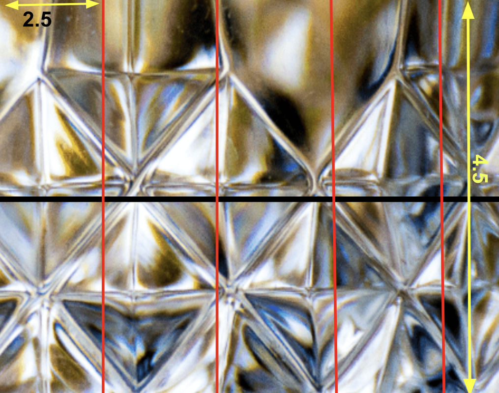
On the right side, I have chosen a specific section of the glass photo and transformed it into the size of the canvas. I try to choose a section that shows the shape, and the Value of color ( light and dark ).
|
In this piece, I choose the glass image on the left side. I chose this image because I like the look used in the image. The way the glass looks in the shapes is beautiful. I like the value of color (light and dark color) that has been used here. Most of the canvas used light areas and some dark areas which makes it more Cool.

|
{ - Measurement - }
|
I measured the canvas, and it turned out to be 9 by 7 inches. To create the selection for my drawing, I used some mathematical calculations. As a result, I divided it into a 4-and-a-half section that measures 2.5 for each. For the horizontal, I used one line so it is 2 sections that measure 4.5. My intention in making it a challenge was to add a significant amount of detail without grouping more sections.
|

|

|
{ - Color & Paint - }

Here, I applied the color technique that I have been practicing. I chose to begin by drawing the areas with the most prominent colors. Starting from the top, I used a combination of dark brown and dark yellow mixed with orange. I used the Rigger brush to paint the small details on the canvas, also I tried to spread the colors from each other by using the Rigger brush. I use a Round brush to paint the big details. Sometimes I use a flat. On the left, this is my first paint for the artwork.
|
These are the colors I used to create my artwork. Most of the part I mix a yellow with organ, and yellow with organ and brown. I think these colors that you can see on the left can match the artwork photo. Throughout the process, I also used a blue and gray and black for my artwork.


#2
|

#7

#8
|

#3

Final piece
|

#4
|

#5
|

#6
|
Experimentation -

In the right photo, The paint was not in a line shape I used a Flat brush but it was way harder to make a line that could be smooth. I put a small oil paint at the end of the brush and I handed the Flat brush in a vertical way so I could Paint in a smooth way but it did not work it was harder. To fix this and make it easier, I decided to use a Rigger brush and I found out it was a better way to make the line smooth.
|
Here I used more white color. So the color was got curvy. The background of the sketching been reveal. The arrow shows that the white color pass the brown color which is that not should be. I let it to dray so I can add white on it and make it not curve, and it worked. After that I decide to paint the brown color after I done with the white color.

|
Reflection -
|
|
I think I did well on the first project, but I could do better next time. I did a great with sketching for the artwork. It seemed hard to mix colors that were the same as in the photo and I took time but overall I think the colors are similar to the photo I used a great mixing colors for the artwork. There is some white dot that is on the artwork. I need to work on new art techniques and keeping the line spread well to paint.
|
