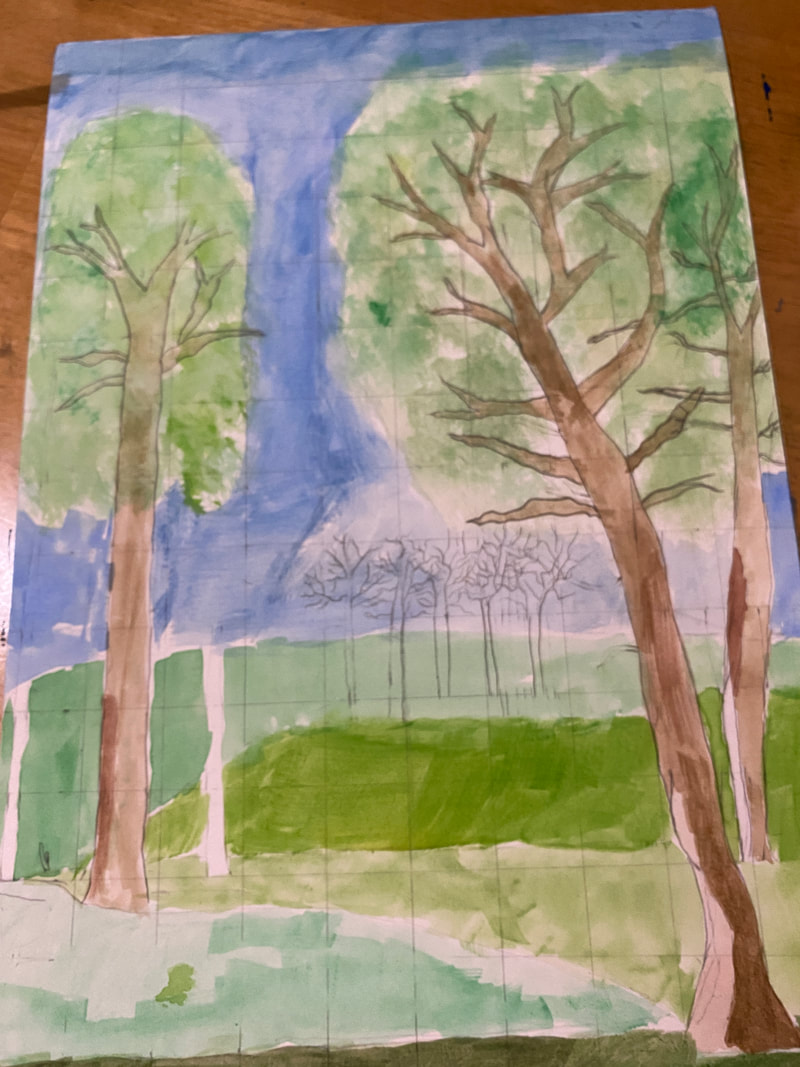
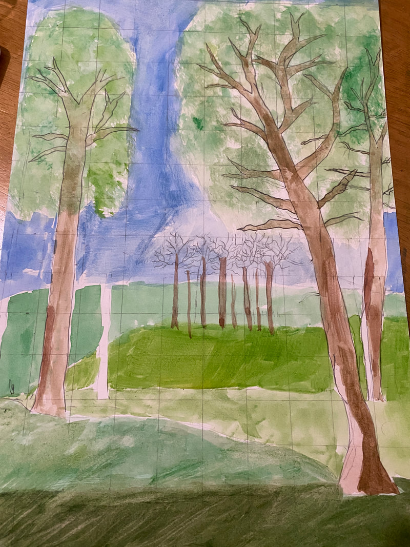
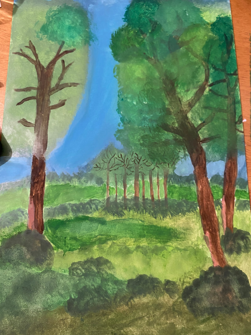
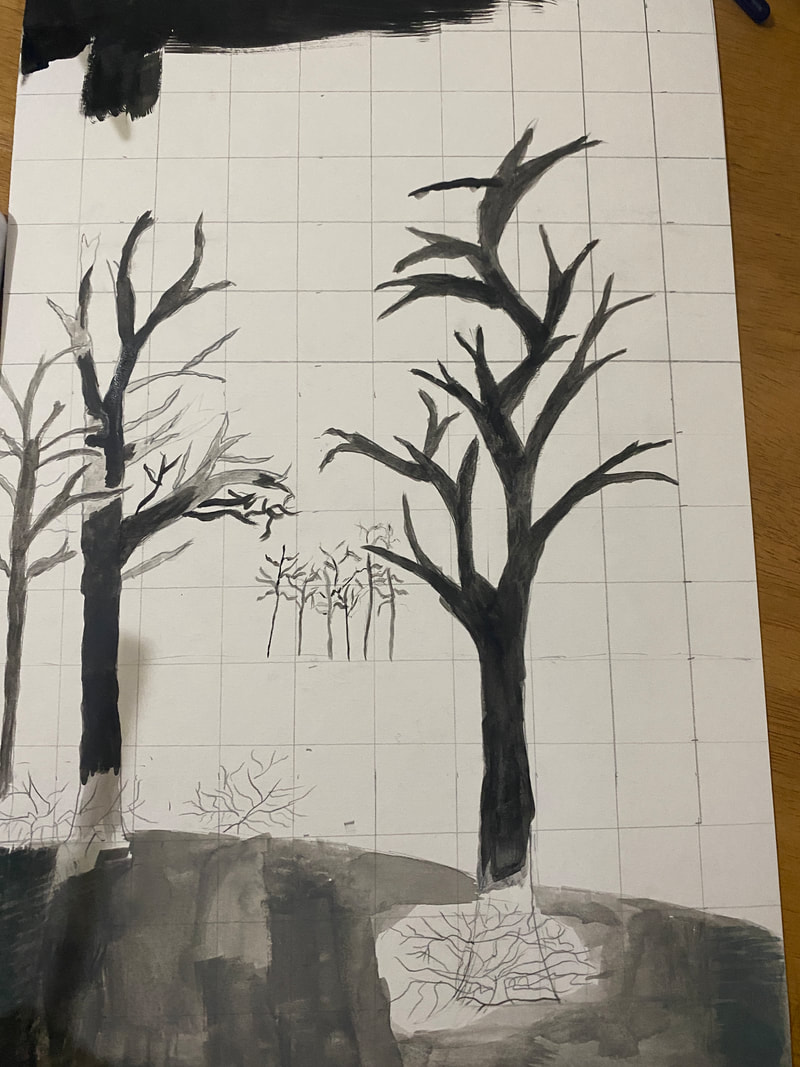
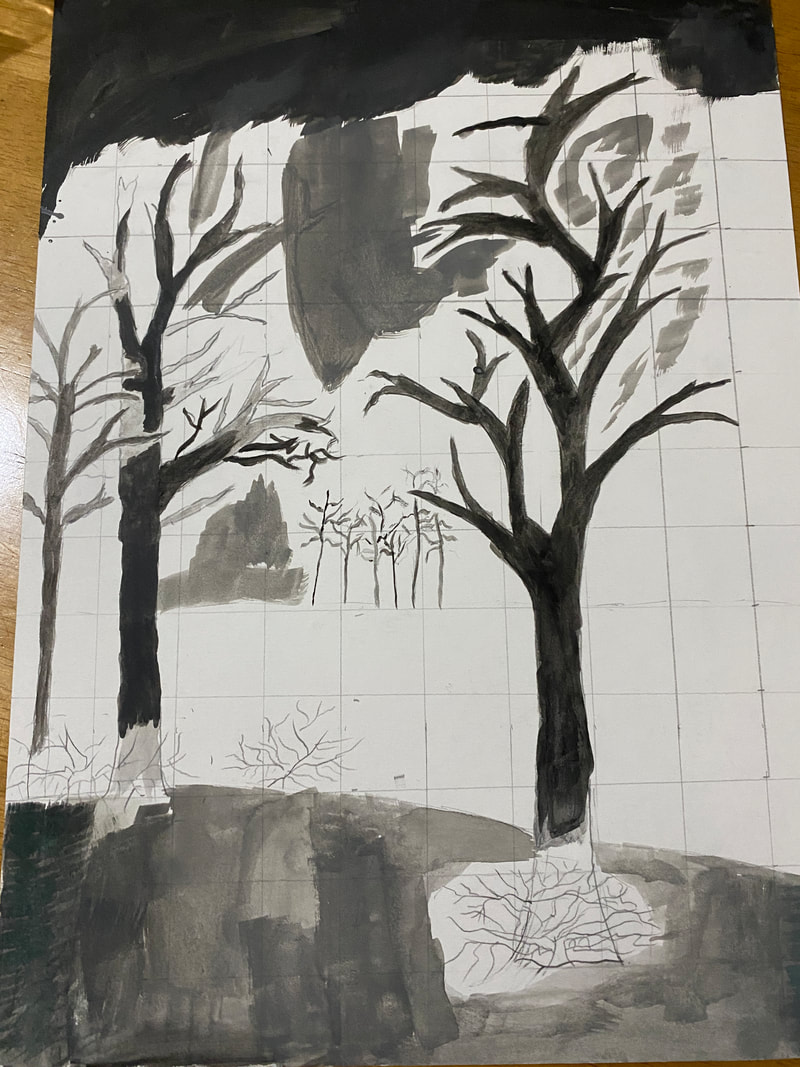
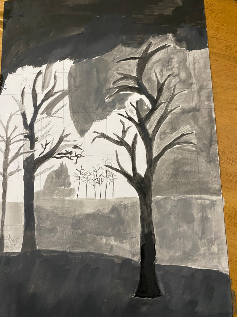
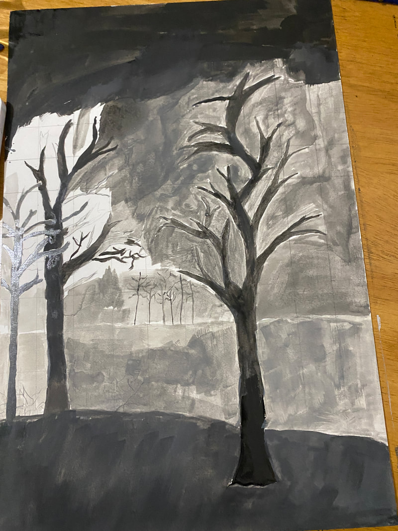
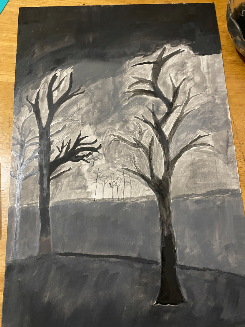
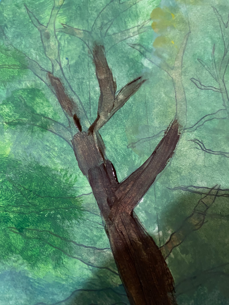
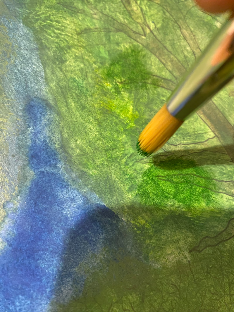
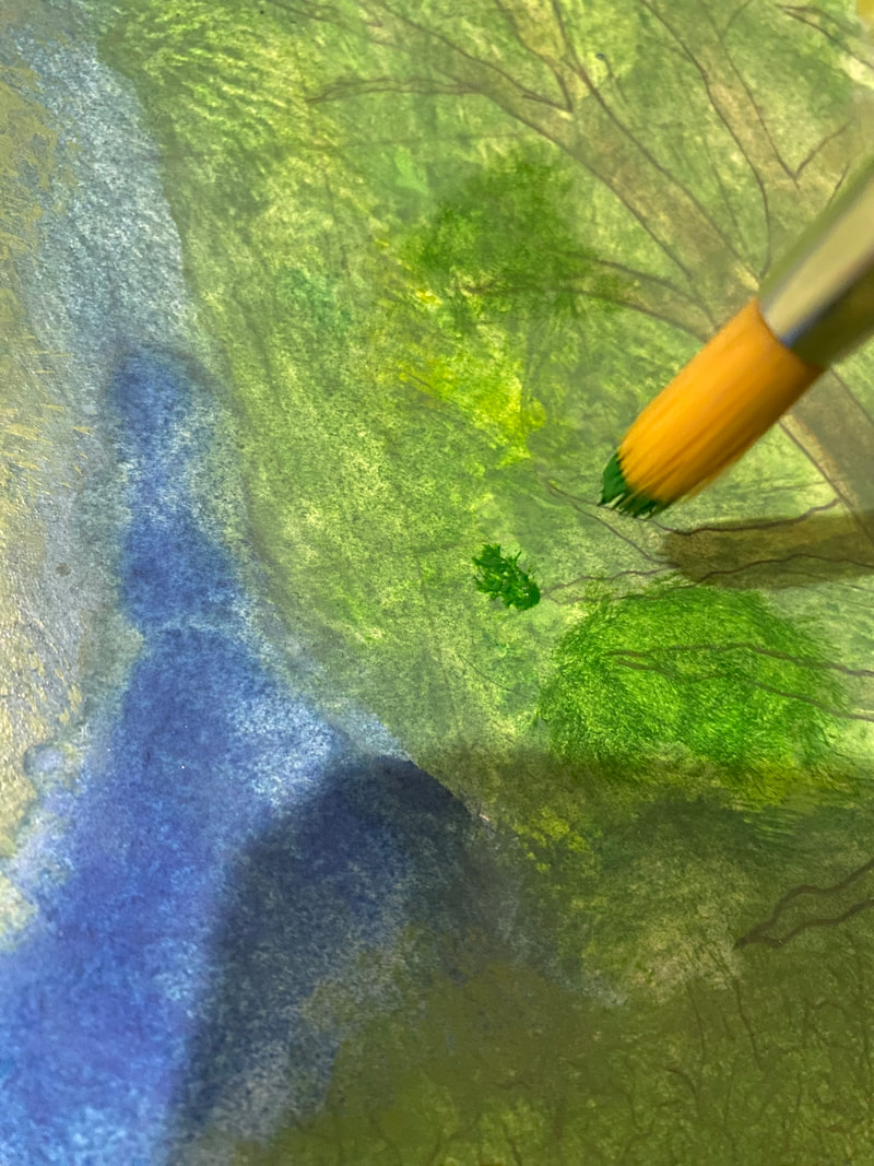
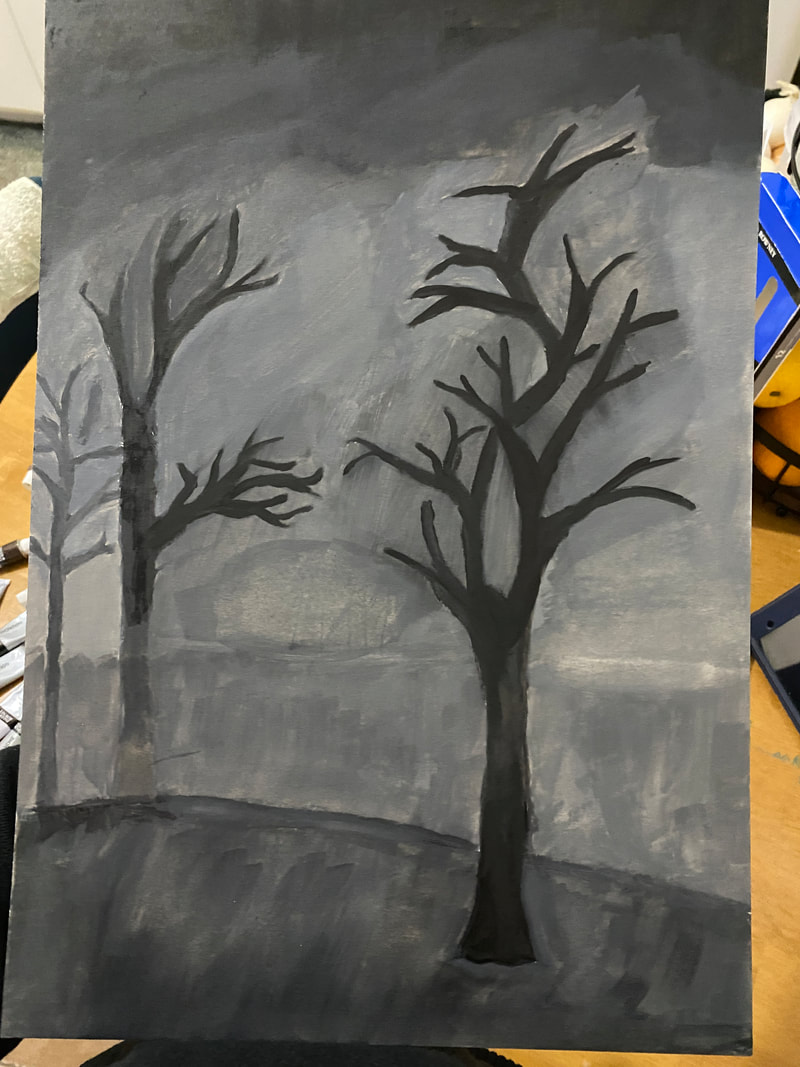
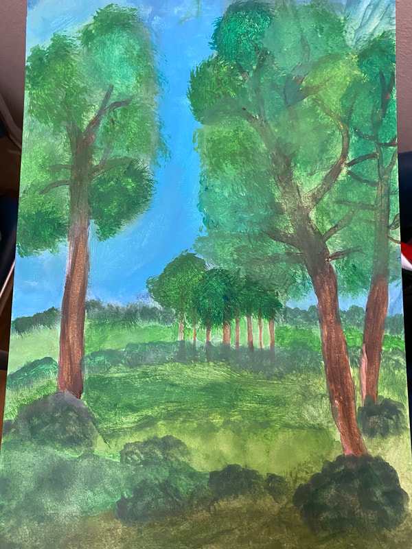
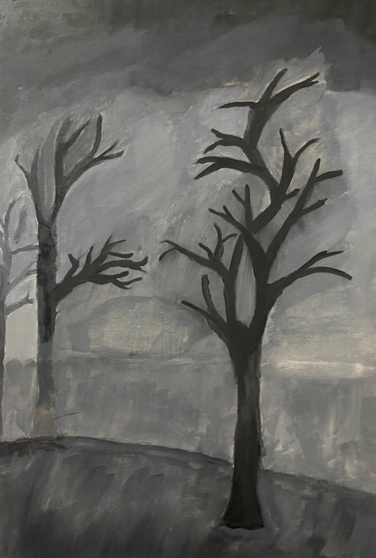
This artwork explores nuanced emotions in contrasting moments—the vibrancy of summer, serenity of winter, and introspection in the night. 'Great Summer' vividly captures the positive essence through skillful color interplay. 'Depression Time' portrays somber night emotions with a dark-toned palette, reflecting melancholy. The deliberate contrast in colors forms a visual narrative, inviting viewers to navigate the emotional spectrum within the artwork
{- INSPIRATION -}
Albert Bierstadt
Albert Bierstadt, a significant artist from the 19th-century Hudson River School, particularly draws my interest with his artwork "Among the Sierra Nevada Mountains, California." This painting, created to showcase the stunning beauty of the American West in the mid-1800s, uses vivid colors, bright depictions of nature, and careful attention to detail. Bierstadt's focus on untouched landscapes and the powerful emotions they evoke resonates deeply with me. The painting, guided by principles like balance and proportion, creates a strong sense of admiration. For my own work, inspired by Bierstadt, I aim to incorporate his luminist techniques, experimenting with vibrant colors to convey a similar sense of awe in natural landscapes. The objective is to capture the profound essence seen in Bierstadt's artwork while emphasizing the importance of environmental preservation and appreciation. The artist's intentions, emotional impact, and technical brilliance in "Among the Sierra Nevada Mountains, California" provide valuable insights that will shape my creative efforts, infusing my work with a spirit reminiscent of Bierstadt's deep respect for the natural world.
{ -Planing- }
Positive illustration
I was practicing how to create a drawing that shows the theme. I start to sketch my positive illustrations. From using the inspiration artist to shows the emphasis of how the artist was making the color and the texture and the value are important. I try to sketch fast to and showing these idea of the art elements and the principal. I noticed that the sketch was not cleared and it should have a good sketch to draw my final positive illustration. These drawings do not showing the values and the texture and the color to represent my theme that shows the emotion of people when they see it as you can see on the right. On photo #1 I did not add my details , and on photo #2 I decided to add some detail. a
|
#1
|
#2
|
#3
|
This photo shows my final sketch of the positive illustration. This sketch is clear, and shows the values of the darkness and the lightness by making line that spareted each other section of the values and that shows the similar to my art inspiration when my artist used the darkness and lightness of the color to shows the fall season.
|
Negative Illustration
I want to shows value and the texture and the color to create my theme of emotion people. I decide to not add many detail as the positive illustration because I want to shows the winter season on night and add a line that sapertaed the light from the dark to that make them feel depredation about the winter. I
|
{ -Process- }
ILLUSTRATION 1
Using the watercolore paper, I start to practice the drawing befor I start drwaingin. I was practicing the water color by using the flat brush because I want get know how to use the watercolor.
This photo shows the colors that I used for my two illustration. I use green for tree, grass. I use light blue with dark blue and some green to do the sky. I use the brown and dark brown to do the tree. For my 2nd illustration I use black for for trees, and some of sky. I use gray and dark gray to do the ground and some of the sky.
|
Grid Method, and Gouache:
I started sketching by using the grid method. The grid method supports my sketching. To use the grid method, I divide the illustration board into squares by using roles. This makes it easier to print efficiently and more organized. Next, I use gouache for my artwork piece. I mixed some water with dark green , light green, brown, and blue colors. I applied these colors by painting a watered-down layer to establish the color foundation. I did that because I wanted to see my project and not get mixed and paint the wrong color. This initial step emulated the transparency of watercolor, as you can see in photo #2. |
#1
|
#2
|
ILLUSTRATION 2
In the next illustration, I followed a similar technique by sketching using the grid method. I did not add details because it would convey a negative feeling. The main idea of this was to mirror the first Illustration that I drew but adding a negative color such as gray and black, and also removing some detail color.
Also, I used gouache on this illustration. I mixed water with black, and gray colors, I applied these colors by painting a watered-down layer to block out areas for shadow and light, like the same technique used in the previous illustration piece. Here is the type of brush (flat, and thin ) that I used for this illustration part.
|
I use flat brush and start to draw the background or the ski. I use light gray color on the bottom of the background, and I use the dark gray on the top of the background.
|
Here, I was contunie of drawing. For the small detail I use the small flat brush and the round to draw the detail.
|
After I am done of the ideal of how it going to be the illustration. I start adding more layers to make it have texture and the white backgrounder and the pencil will be disrepair .
|
Experimentation
CRITIQUE
Comparing:
The "Seasons in Spectrum" series features two illustrations, one aiming to replicate the composition of a reference image, and the other a recreation reflecting a similar composition. Both illustrations share a central theme of intense detail depicting figures in worship within the Catholic faith. The nuanced use of line, shared color palette, and warm tones emphasize the similarities between the two pieces. The meticulous alignment of elements and design principles in both pieces affirms the accomplishment of the intended resemblance.
Contrasting:
Seasons in Spectrum is an illustration that takes a deliberate departure from the reference piece by Menzel, focusing on the absence of detail. The second illustration, intended as a departure from the reference piece, emphasizes the absence of detail, presenting a stark, detail-less reinterpretation. This deliberate departure in design, primarily concerning composition and the play of light on objects, impacts values. The essence of "Seasons in Spectrum" lies in its harmonious parallels and deliberate contrasts that breathe life into the artistic narrative. The deliberate departure from the reference piece and the illustration's composition create a striking contrast.
Refelection
I learned a lot by carefully drawing and using the grid method to capture tiny details. Trying out gouache paint helped me figure out how to layer colors, which made me understand the paint better. This project was super important for me and helped me grow a lot. I got the idea for the project because I wanted to show all the different feelings that come with different seasons. I tried to make the colors, light, and shapes in my artwork match how I felt when I looked at the inspiration photo. It was tricky to make sure the positive and negative parts of the drawings looked right. I had to think a lot about how to use colors and shapes to make people feel different things. The hardest part was using gouache paint in lots of layers. It took a long time, and I didn't enjoy that part very much. But I really liked trying to make a picture with hardly any details, just shapes and colors.
ACT
Clearly explain how you are able to identify the cause effect relationship between your inspiration and its effect on your artwork?
I can understand how my inspiration influences my artwork through thorough research and gathering information about the artist. Exploring their style and discovering the themes in their work provides a clear link between what inspires me and how it reflects in my creations.
What is the overall approach the author has regarding the topic of your inspiration?
The artist I researched approaches the topic with a focus on capturing the stunning beauty of nature. They use vivid colors, attention to detail, and luminist techniques to convey a deep appreciation for the untouched landscapes. This approach guides my own work as I aim to incorporate similar techniques and convey a profound connection to the natural world.
What kind of generalizations and conclusions have you discovered about people, ideas, culture, etc. while you researched your inspiration?
Through my research, I've generalized that the artist's emphasis on nature and emotion resonates with a broader appreciation for the environment and the human experience. The conclusions drawn highlight the importance of balancing vibrant colors, attention to detail, and emotional depth in creating impactful artwork.
What is the central idea or theme around your inspirational research?.
The main idea stemming from my inspirational research centers around the impact of emotion. I'm intrigued by how emotions are portrayed in the artwork and how colors, details, and composition contribute to conveying different feelings associated with each season.
What kind of inferences did you make while reading your research?
While delving into my research, I inferred that the artist's deep respect for the natural world and the use of specific techniques, such as luminism, significantly contribute to the emotional impact of their work. These inferences guide my own artistic choices as I experiment with colors, textures, and emotions in my creations.
Bibliography:
“Albert Bierstadt.” Artist Info, www.nga.gov/collection/artist-info.6707.html. Accessed 28 Nov. 2023.
“Albert Bierstadt.” Encyclopædia Britannica, Encyclopædia Britannica, inc., www.britannica.com/biography/Albert-Bierstadt. Accessed 28 Nov. 2023.